Anomaly Detection Visualization
Make the detection of anomalies easier for cybersecurity analysts
Overview
I had my summer internship at FireEye as a product designer. FireEye, Inc. is a cybersecurity company that provides products and services to protect against advanced cyber threats, and Helix is their most advanced security operations platform to improve malware/anomalies visibility and detection.
My job was first to update their style guide, enhance old features and design new workflows/feature for their endpoint products and improved the data visualization for Helix.
Problem Statement
There are two pages that users use need visual improvement, one is dashboard page, and the other is search results page. Both analysts and operational people use the dashboard to view summary, and the analysts uses the search page to do the further investigation(figure 1).
So good visualizations can make the relations between different data clearer and more obvious, which can help the user work more efficiently.
Objectives
There are several expected project outcomes from my director and manager. And the problem resides in both pages, and I listed them out in the table below.
| Objectives# | Brief | Specifications | Related Page |
|---|---|---|---|
| 1 | Widget | Add new widgets to the dashboard and provide exploratory/drillable visualizations. | Dashboard |
| 2 | Consistency | Make the visualizations consistent between dashboards and search results page. | Dashboards, search results page |
| 3 | Transformations | Explore the flow of pivoting from search results into a visual presentation. | Search results page |
Design Process

Scope
Preliminary research
I talked to various users of the Helix, including the higher-ups who have insights and expectations of the visualizations, analysts whose job is to find anomalies and hunt evils, as well as operational people who care about higher-level data summary. I generated the following use cases to cover both analysts and operational personas:
-
For the Analyst Detection persona:
- Present event classes and their sources
- Show alerts by risk over time
-
For the Operational persona:
- Show alerts pattern over time
- Present events per generated alerts
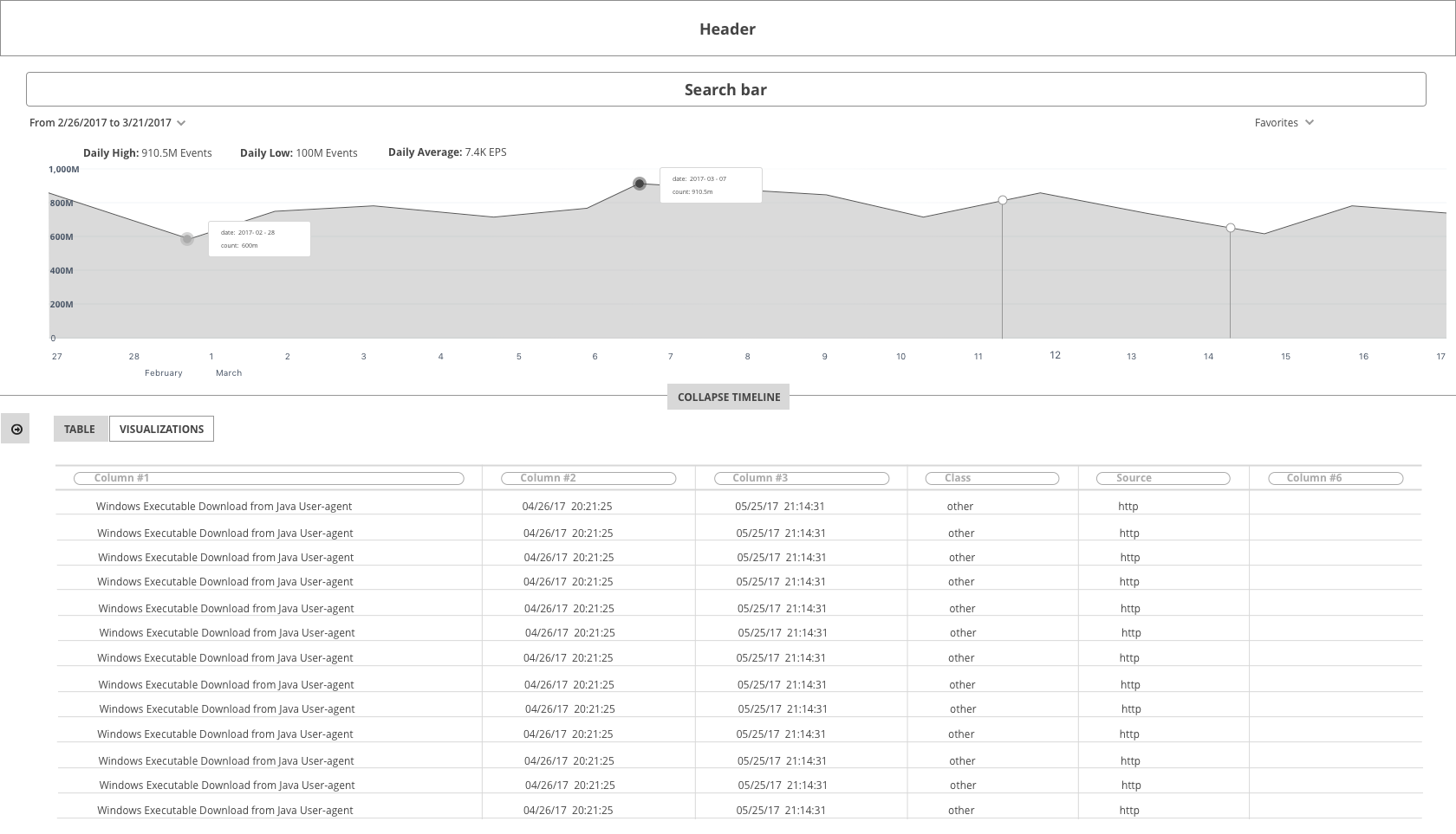
1_Search Results - Table
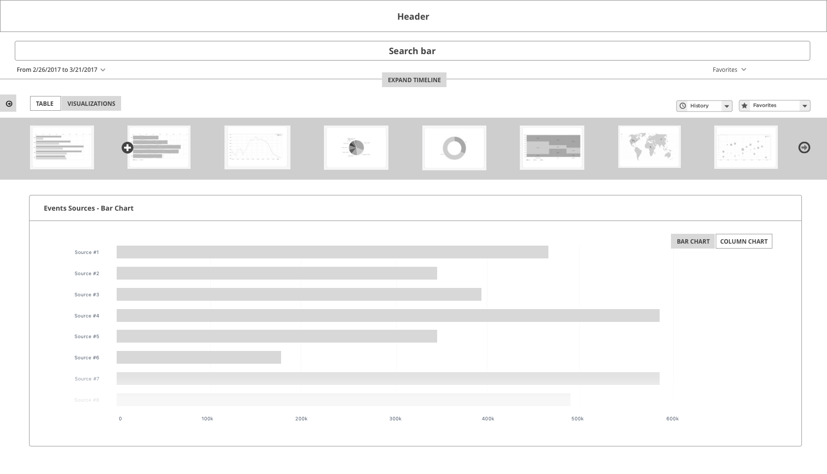
2_Search Results - Visualizations
.png)
3_Search Results - Visualizations(Add new viz modal)
Rapid Prototyping
To add more useful and drillable visualizations(problem 1), I first needed to figure out how users interact with the dashboard and search page. So I used paper prototyping to show the 4 use cases generated below(figure 2).
To create natural transformations(problem 3) from search results to visuals, I used lo-fi prototyping to present the flow of creating a visualization through viz library, as shown above. As for the 3rd issue - to make the visualization consistent, I decided to solve after specific visualizations have been confirmed.
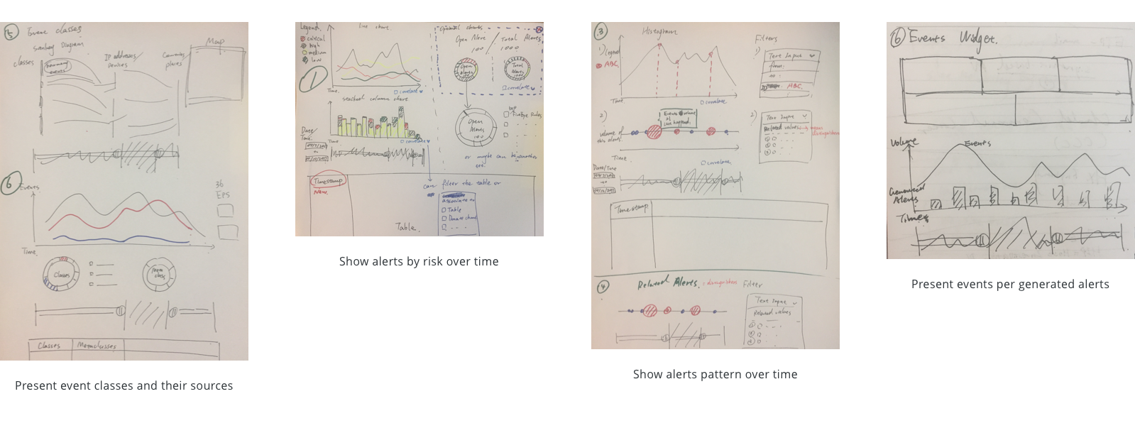
figure 2. Paper prototyping
Rescoping
After reviews with other designers and users, we achieved the consensus that compared to using libraries and letting the user choose the visualizations themselves, creating drillable visualizations and digging process can be more useful. So I decided to proceed with:
- Analysts Persona: because only analysts will drill into the visualization
- Search Page: because search page contained more detailed and complex investigation process and covered the use case of the dashboard.
Research
After deciding to move forward with analysts, I talked to tier 1, 2, 3 analysts to find out their common pain points in order to create general use cases. First, I needed to understand the following highlighted terms and their relations - events, rules and alerts(figure 3).
Scenarios
Based on the findings, I distilled the daily interactions of analysts into the following three scenarios and highlighted the individual finding in the next section.
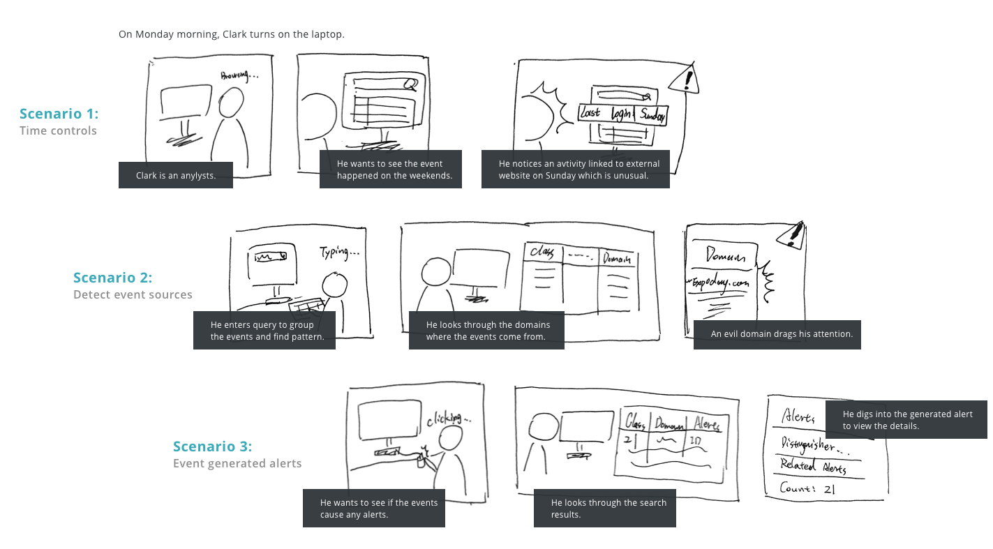
Key Findings

Initial Design
Ideation
To solve the pain points and fit the use cases, I first categorized the findings into insights and came up with some possible solutions matched against each of the findings and then created wireframes and tested with users.
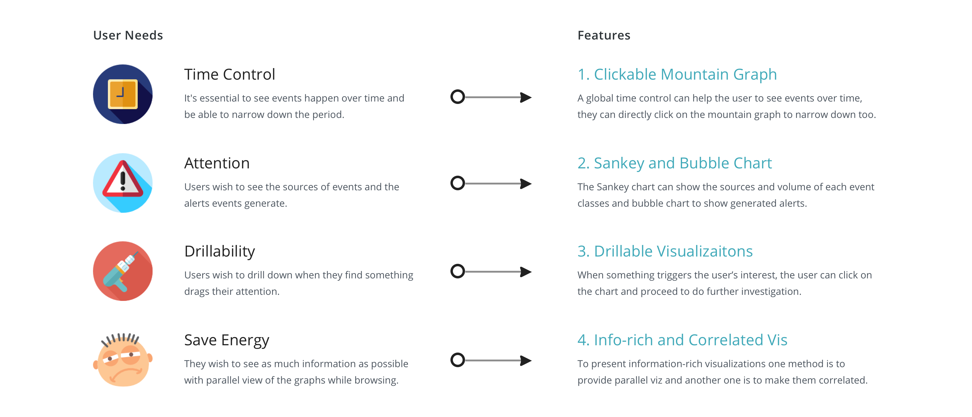
Wireframes
Insights
After doing several rounds of review internally in the design team, users as well as the higher-ups, I collected the following 5 insights and conducted iterations in the next section.
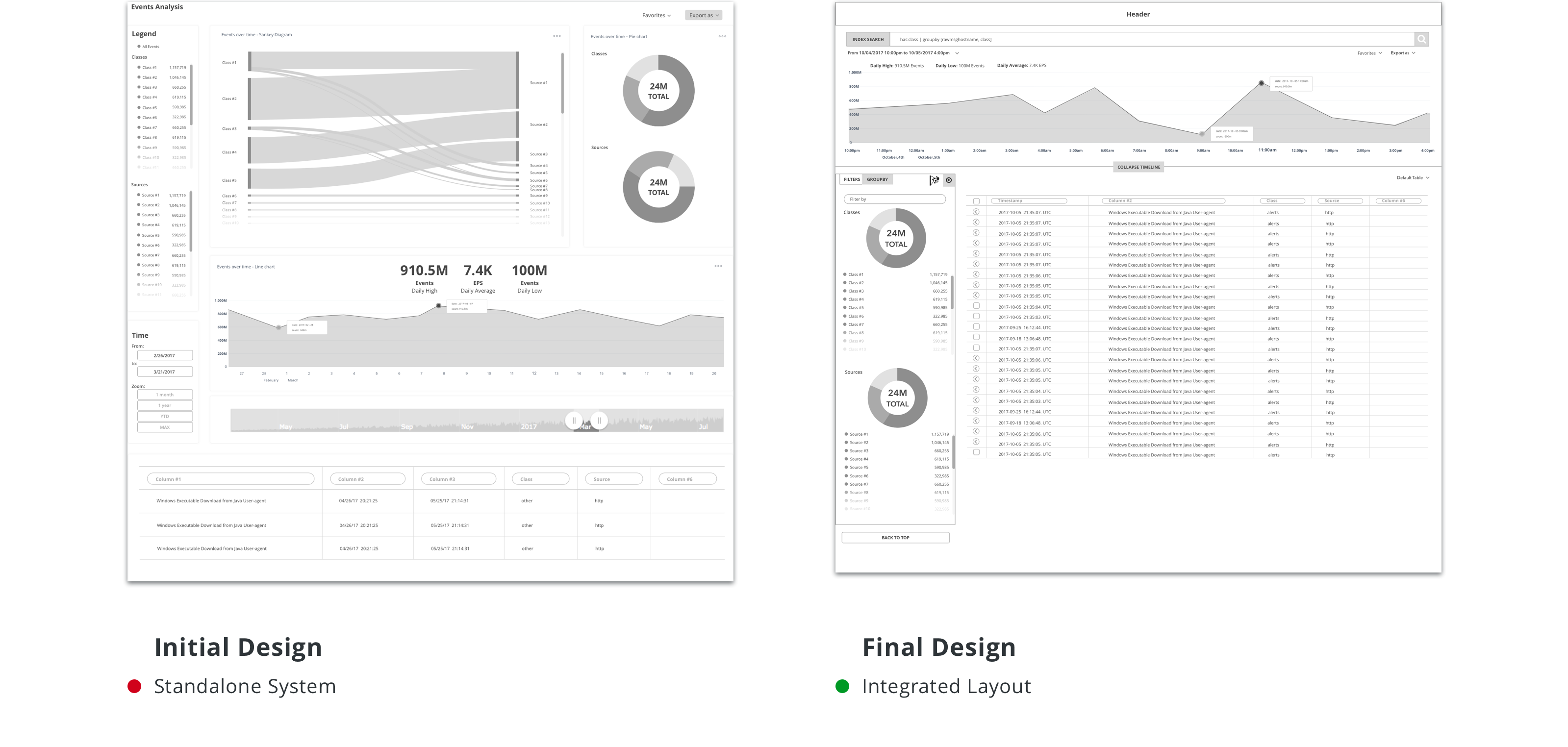
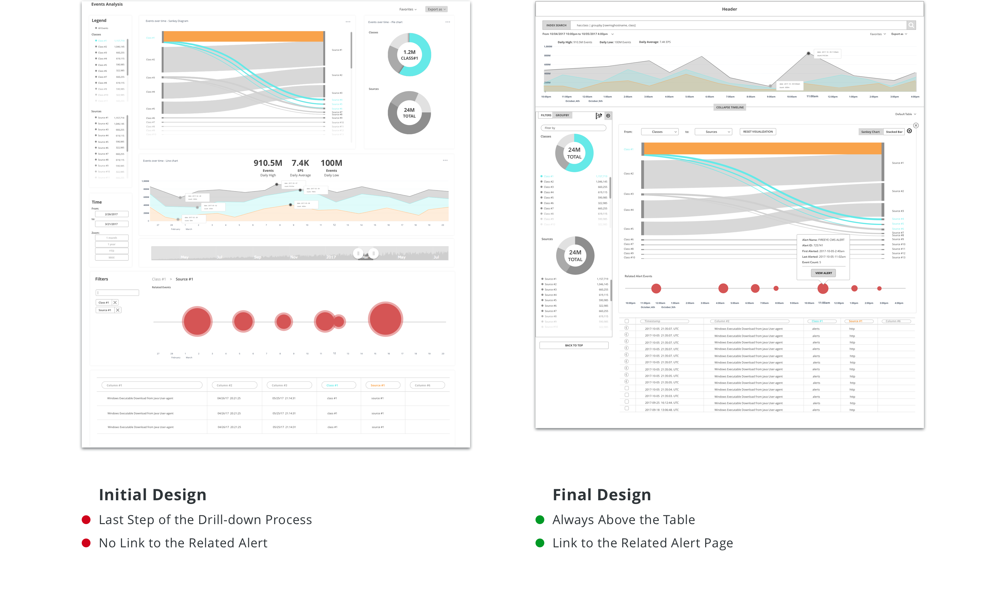
1. Fit the wireframes into the real search page framework.
2. Think about how to show visualization without compromising the table which is the primary display of search results.
3. When many events fall into the same alert, they want to drill into the alert page to see the detail, like distinguisher, event count, etc.
4. Generalize the class and source pairs into more use cases.
Iterations
Based on the design reflection and the feedback gathered through the reviews, I made several rounds of iteration, tweaking some details to make the flow more intuitive and useful.
Iteration 1. Adapt to Helix
Iteration 2. Drill-down Panel
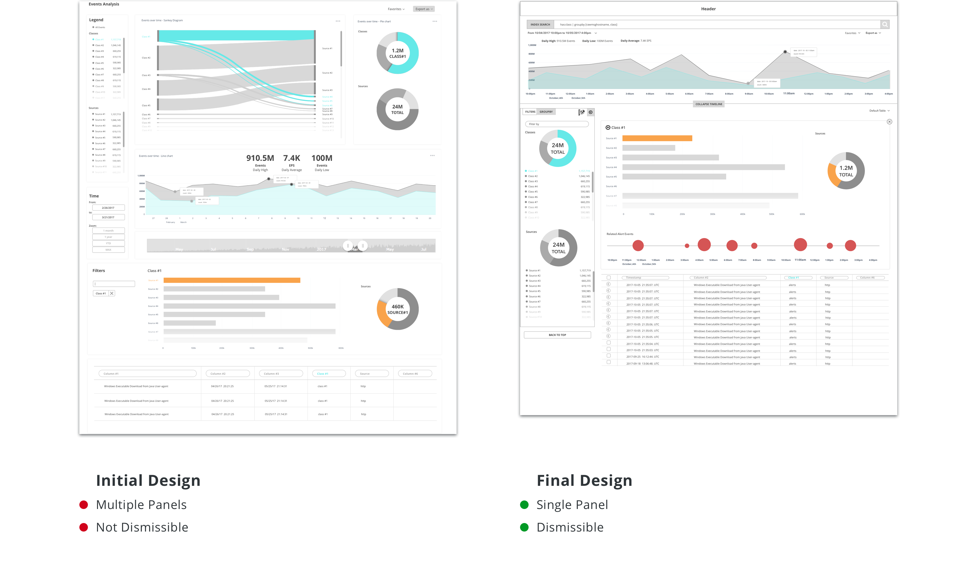
Iteration 3. Bubble Chart
Final Design
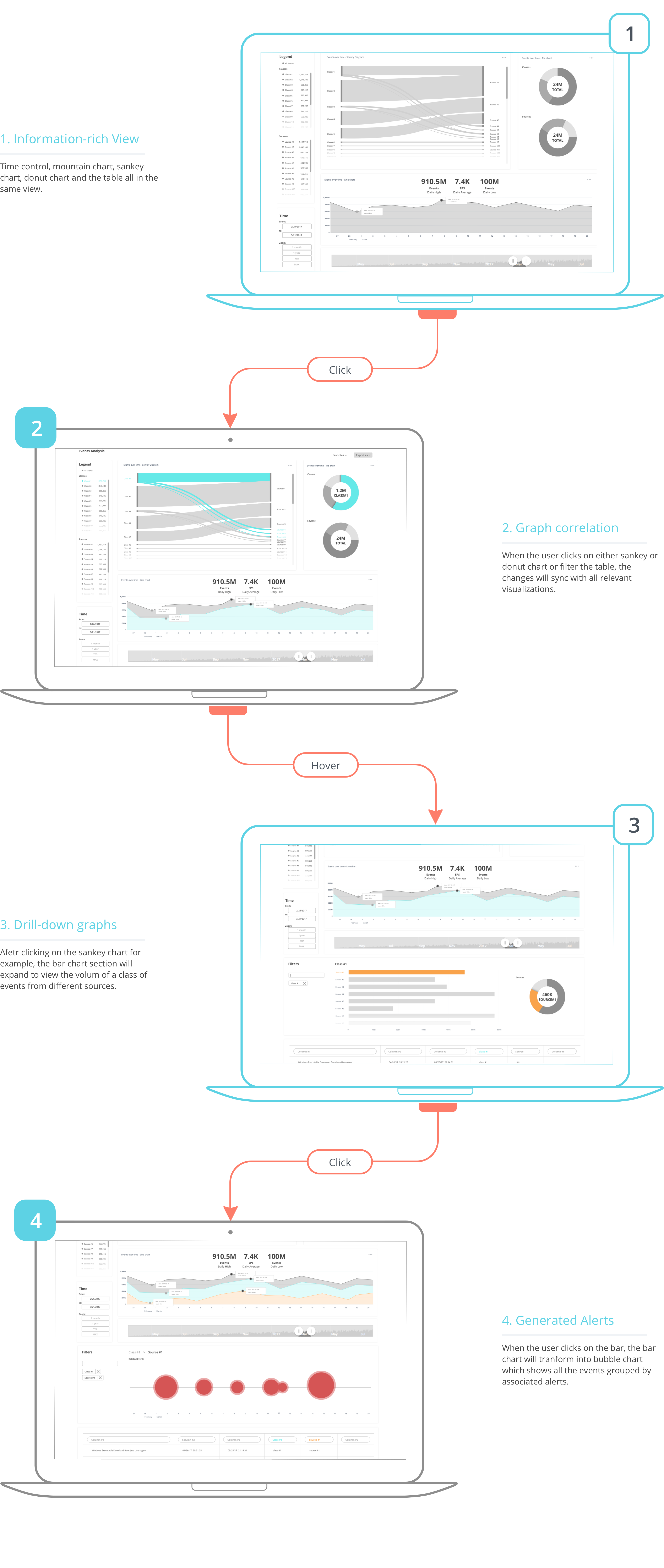
Here in this section, I showcase 4 key features of this visualization exploration project.
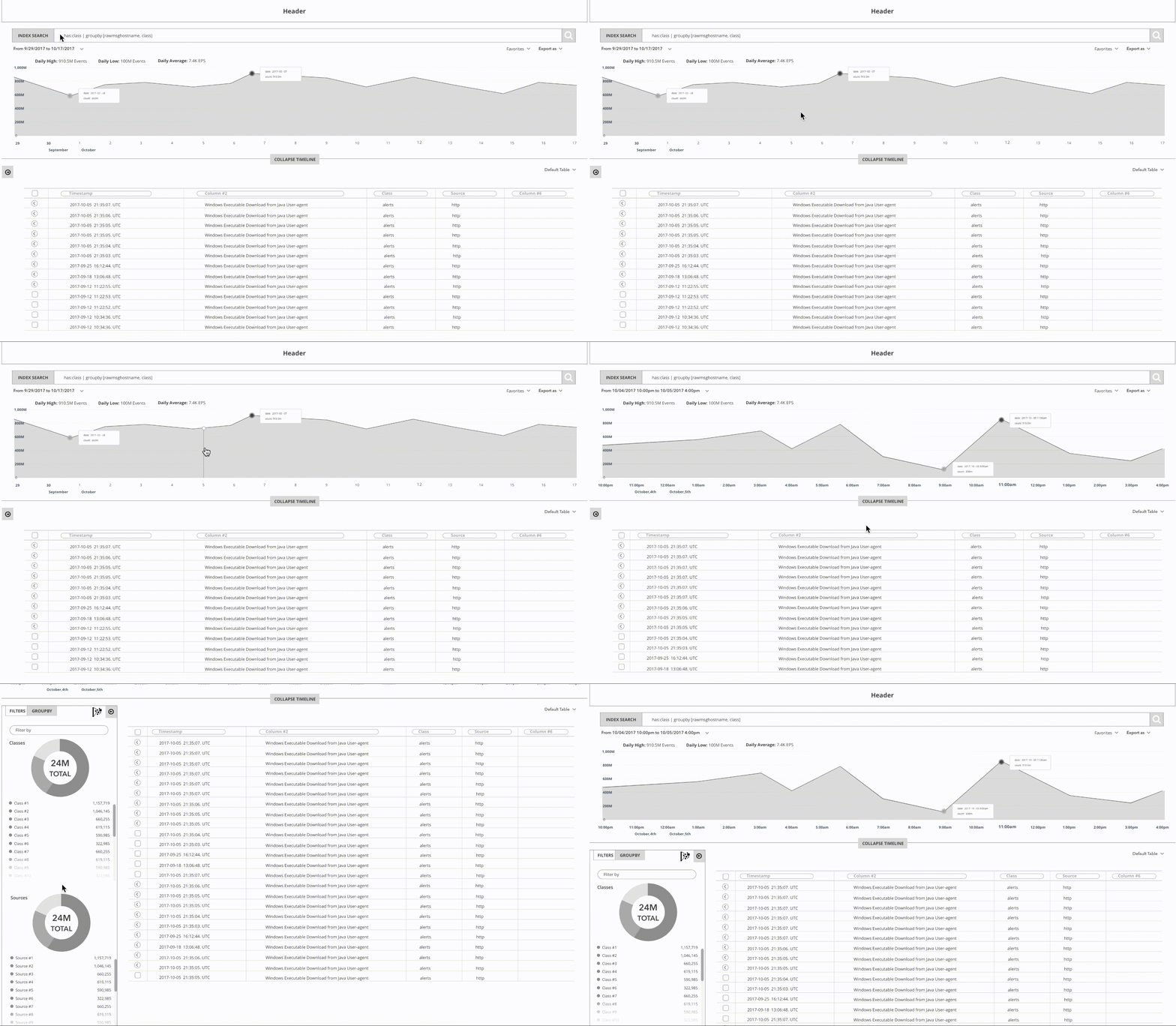
Invision Mock-upsVisualization 1.
Clickable Mountain Graph

- Enter query in the search bar
- The search results will show in thetable.
- Hover on the mountain chart.
- Select a time to filter the time.
- Click the arrow on the left toexpand the filter panel and then see donut charts.
Visualization 2.
Sankey Chart and Correlated Graphs
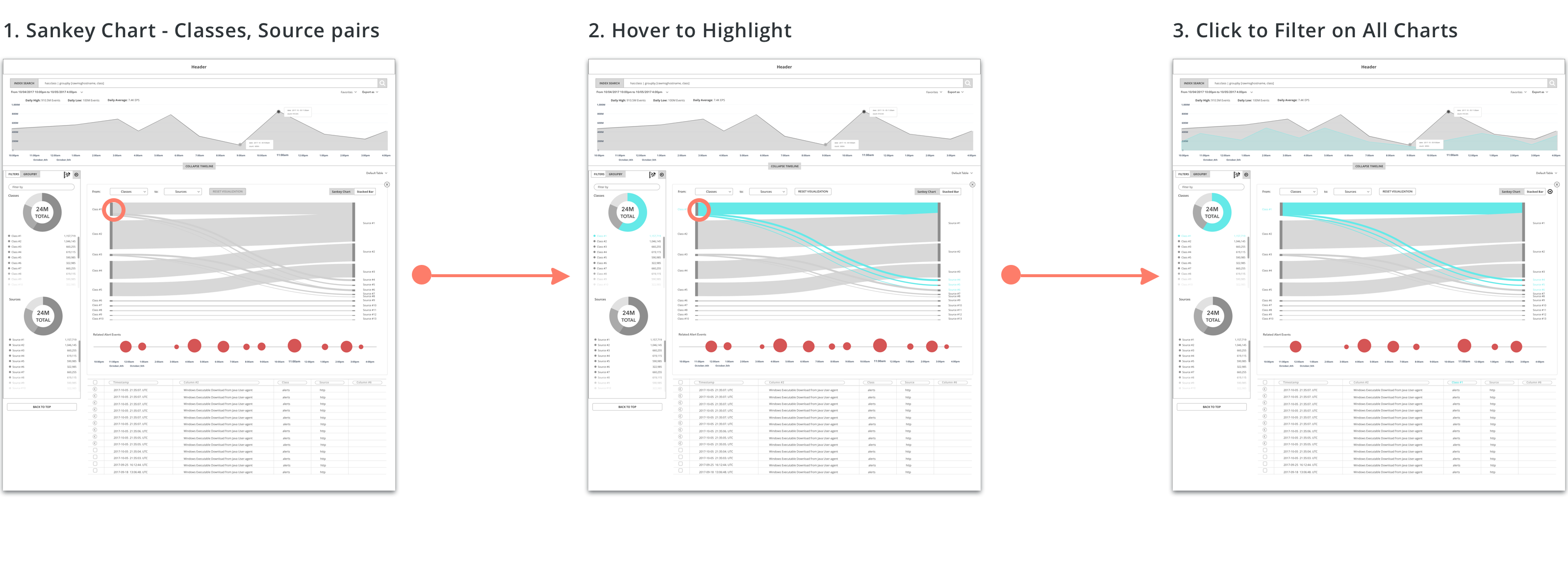
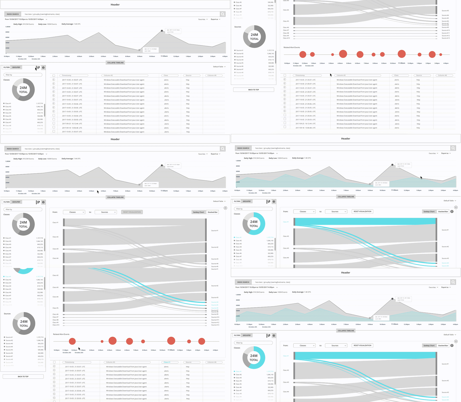
- Click on the "Visualization" icon on the filter panel and the Sankey Chart Panel appears.
- If hover on Sankey or Donut chart, correlated charts allhighlight.
- If click on Sankey or Donut chart, all the charts will befiltered including the table.
- Or select from the dashboard and then go to the search page.
Visualization 3.
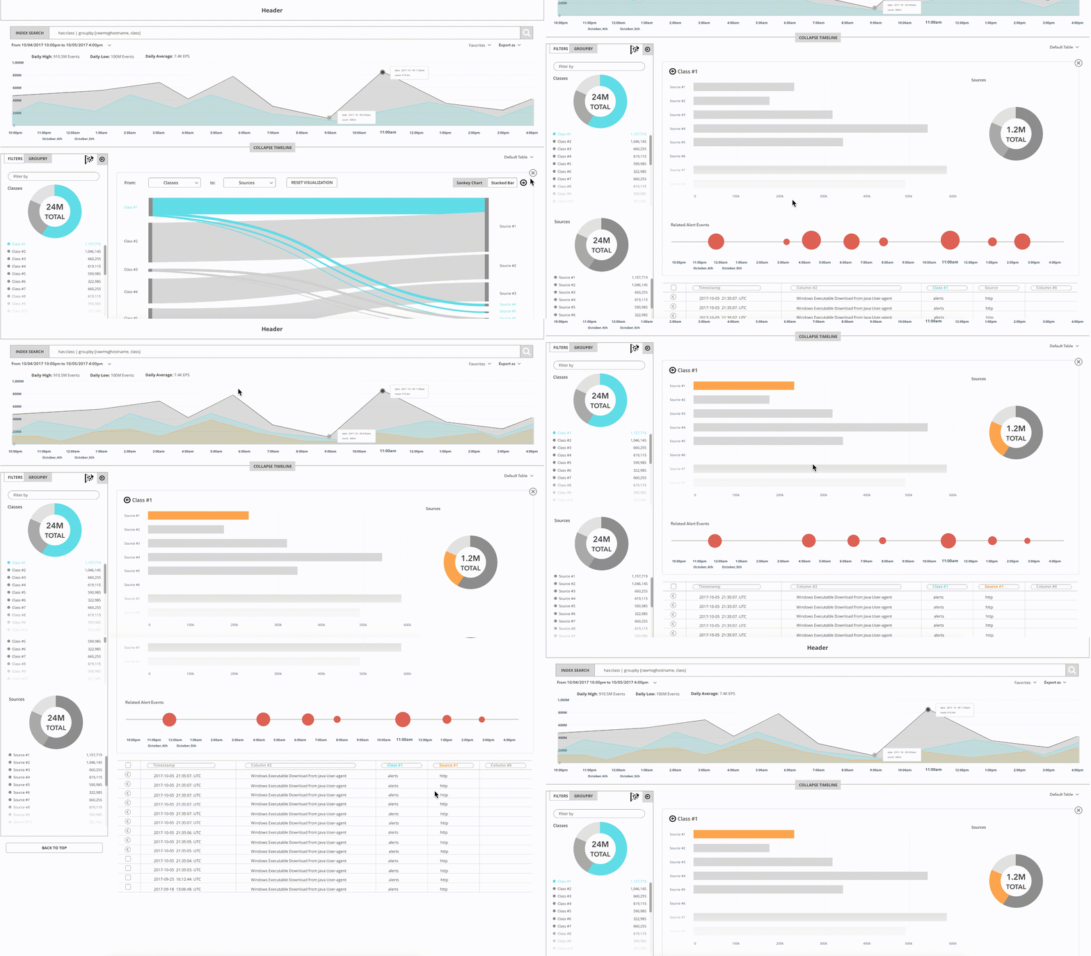
Bar Chart in the Drill-down Process
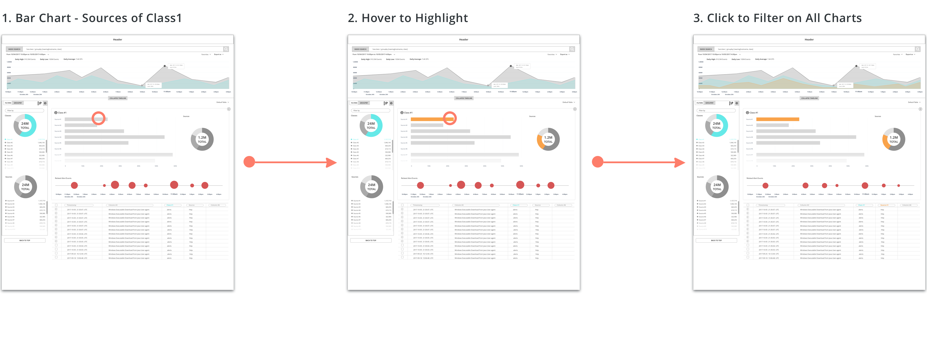
- Click the arrow on the Sankey chart panel and proceed to the bar chart.
- In the Bar chart, the user can see the quantity of events from specific sources.
- The user can hover to highlight the bar.
- The user can click to do further drill-down which will filter all the charts and the table.
Visualization 4.
Bubble Chart Presents Related Event Alerts
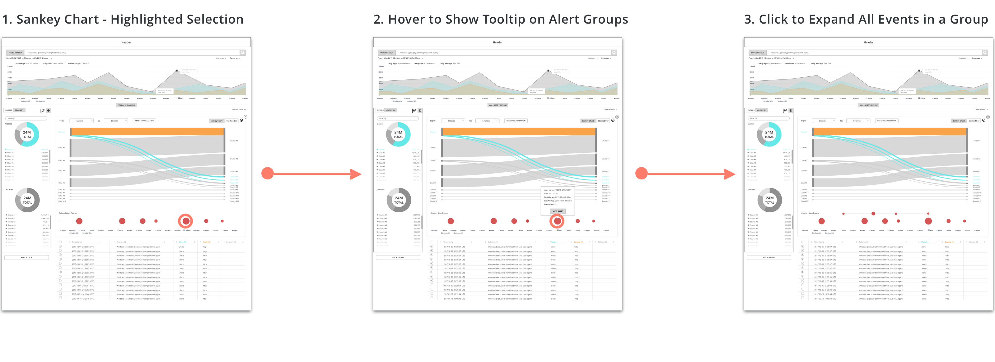
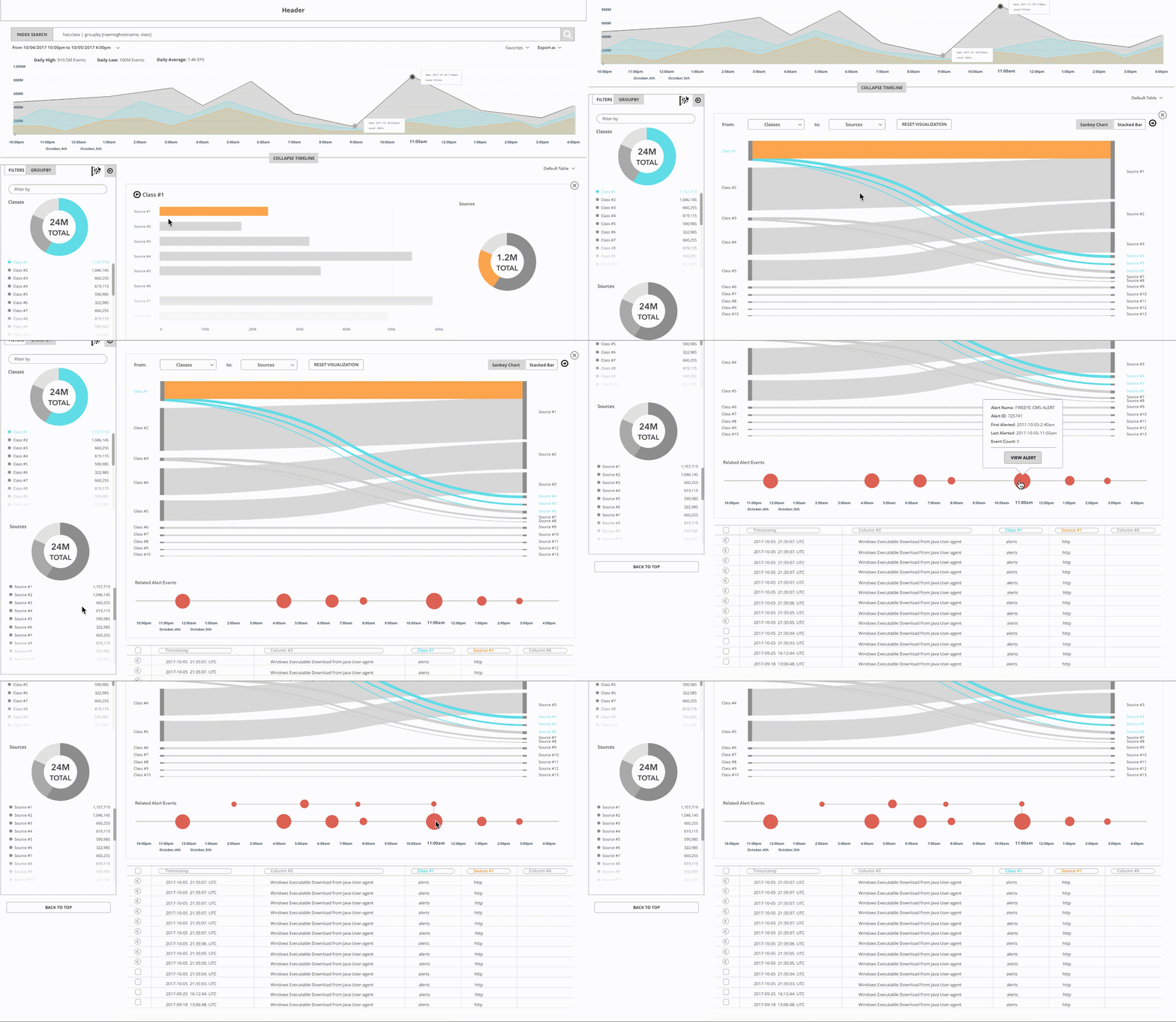
- The bubble chart below show the events grouped by alerts.
- The user can hover on each bubble to trigger a tooltip where shows some highlighted details of this alert group.
- The user can click on each bubble to expand the group and see all the events in this alert.
Impact
This set of prototypes shows the concept of how to help analysts visualize the search results in the table and hunt the evil. Except for the classes and sources pairs, the user can use the query "group by" to visualize the relations between any sets of data, for example, usernames and devices. Analysts can see parallel visualizations and correlations among all charts. They can also drill-down into details and always have related alerts bubble chart to provide a general sense of the generated alert by events.
The data visualization exploration project is still ongoing and passed to the rest of the design team of FireEye. The next step is to review with the PMs and push it forward to the release.

